Sponsored article
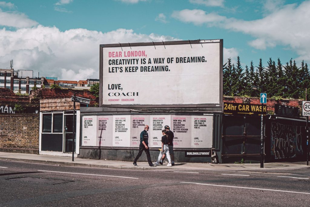
In the case of a billboard, you only have a few seconds to communicate with your audience. So, it doesn’t even need to be mentioned that it needs to contain a clear message and also be readable. Even the best design will be worthless if no one can see it.
To have a clear and readable billboard, you need to keep in mind a few golden rules:

One of the very interesting things about billboard design and advertising is that it gives you the opportunity to be as creative as you want with the place you want to put it. You can always use billboard design to determine exactly what your target audience is doing using the geography and demographics of the area. For example, you can determine the majority of the population living in the area where you want to place your billboards and use that to create a design that directly communicates with that specific community. You can do this by using local “personality”, history, etc., adding humor to the text, design, or customizing the billboard design based on where the audience is going.
All of these things help a lot in creating a visual billboard design. You can’t do it without the right call to action in your ads, regardless of the type of medium you use to communicate with your audience. After all, it’s the trigger button that turns your target audience into your loyal customers; the means to the end goal.
For example, a clever call to action or slogan such as “stretch your legs in 2km” can really help your billboard design stand out and make you gather a good crowd in front of some food court.
You can include a phone number to call, a website to visit or an app to download, but you need to offer the next step.

And since we already explained in the first point that the message needs to be short and simple, you need to make sure how you want to show your call to action on the billboard. You can’t have the entire space littered with text. Therefore, you need to decide which texts are important to use in a bold and prominent way. The call to action text is certainly the end goal, so it is certainly important.
The only thing that differentiates an ordinary product from a well-known brand is “consistency”. You’ll need to take care of this too when designing billboards, as it’s part of your branding strategy. Using certain consistent elements in your designs can help your audience immediately remember your advertisement; no matter where they see it. This means that when using your logo on a billboard, use your brand colors in some way, use the same font types in the text, etc.

It’s easy to look at billboards and think of them as a clean slate for your next marketing plan. However, you need to make sure that your billboard design also adds value to your overall marketing plan by fitting into your marketing puzzle. You need to make sure that the billboard design matches your brand on other platforms such as digital, newspapers, magazines or television in one way or another.
Ensuring continuity between different advertising outlets is just as important as the ads themselves. Earlier, we provided some facts about billboard design and advertising, one of which was about their cost-effectiveness. So, if you think that contracting the design services of a specialized agency would burn your pockets, you need not worry at all. A few hundred extra dollars spent on a professionally designed billboard should be worth considering the design pitfalls that can hurt conversions from advertising or worse, damage your company’s reputation.
A professional graphic designer would know very well how to craft and incorporate all of the necessary elements of billboard design that we discussed above. Starting from font types and sizes, color palette, visual graphics, etc.
Main photo of the article: photo by Kate Trysh, source: unsplash.com