Sponsored article
Good packaging has a positive impact on sales, is memorable and clearly associated with the product. While shopping, the customer has to feel that it was designed with him in mind, so it fully meets his needs. The packaging of a product intended mainly for women will look different, the one addressed to men will look different and the one which is to attract the child’s gaze will look different. What is particularly important at the stage of designing and what should be paid attention to before the finished product is handed over?
At the beginning it is worth asking yourself some basic questions that will help you direct your project in the right direction:
Write down the answers to each of these questions, and the first idea will sprout in your head on its own. However, if you still don’t know how to go about it, it’s a good idea to start with..
Packaging design begins as soon as an idea pops into your head. But what if, despite spending hours on one product, you have absolutely no idea? Start with specifics. Choose a font that best reflects the nature of the product you are selling. More decorative fonts will work well for feminine cosmetics, and especially for perfumes. Font color should not clash with the packaging color, however, do not be afraid of unobvious combinations such as blue and yellow or orange against the background of purple packaging

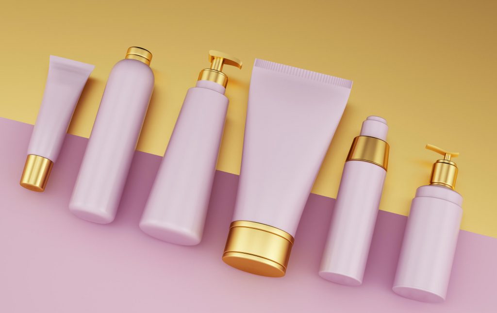
If we are already talking about colors, it is worth to stop here for a longer moment. Often it is the color of the packaging, and not the name of the product that sticks in the consumer’s mind for a longer time. Going back to the store, toothpaste in black packaging, even if we have no idea who its manufacturer is. Specific colors evoke specific emotions in people, and you need to keep this knowledge in mind and combine it with product information. For example, if you are designing packaging for an environmental brand, stay with harmonious green or the austere look of a cardboard box
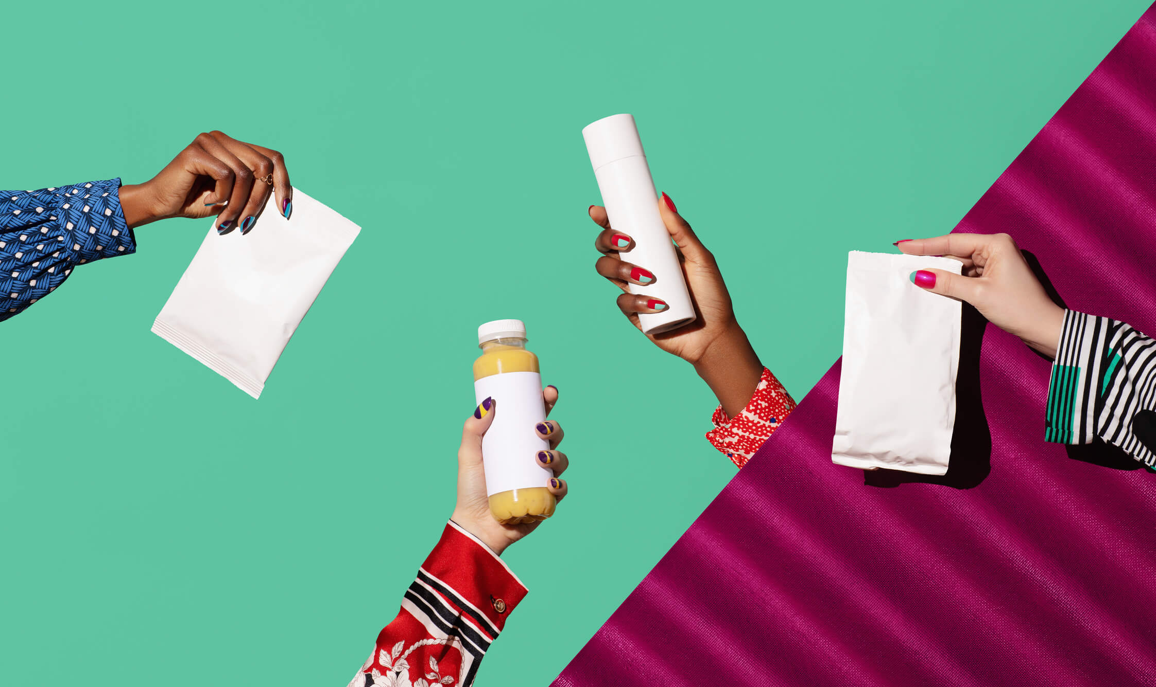
Illustrations on packaging are a way to tell a story about a product. As with colors, graphics are also easily associated with consumers, so they need to be eye-catching and memorable. A great way to put an illustration on the packaging are foil stickers, because they are resistant to weather conditions and (after applying a protective laminate) mechanical damage and UV radiation. Thanks to that even after a longer period of time they will delight with vivid colors, which significantly increases the attractiveness of packaging

Due to the growing trend of zero waste and less waste , ecological solutions are gaining popularity also when it comes to packaging. When buying, customers pay special attention to the material it is made of and whether it can be recycled. This is an important issue not only for environmentally friendly brands, but also for everyday products. After all, the planet should be taken care of every day
Main article photo: photo by Ilka & Franz / DigitalVision / Getty Images