Sponsored article
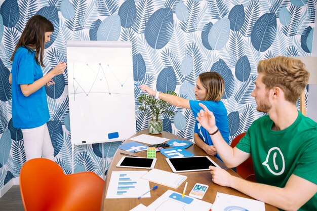
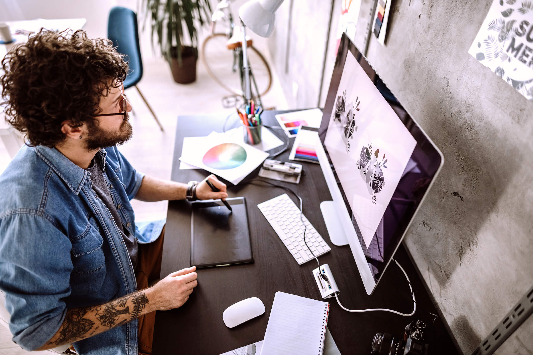
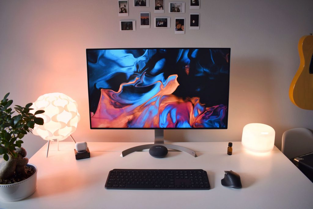
A monitor and a computer mouse are two of the most important tools for a graphic designer. Good equipment is the basis of comfort, but also efficiency at work. You can not economize on the equipment, because it makes the work more efficient, faster and more pleasant. See what parameters should have a monitor for graphic designer
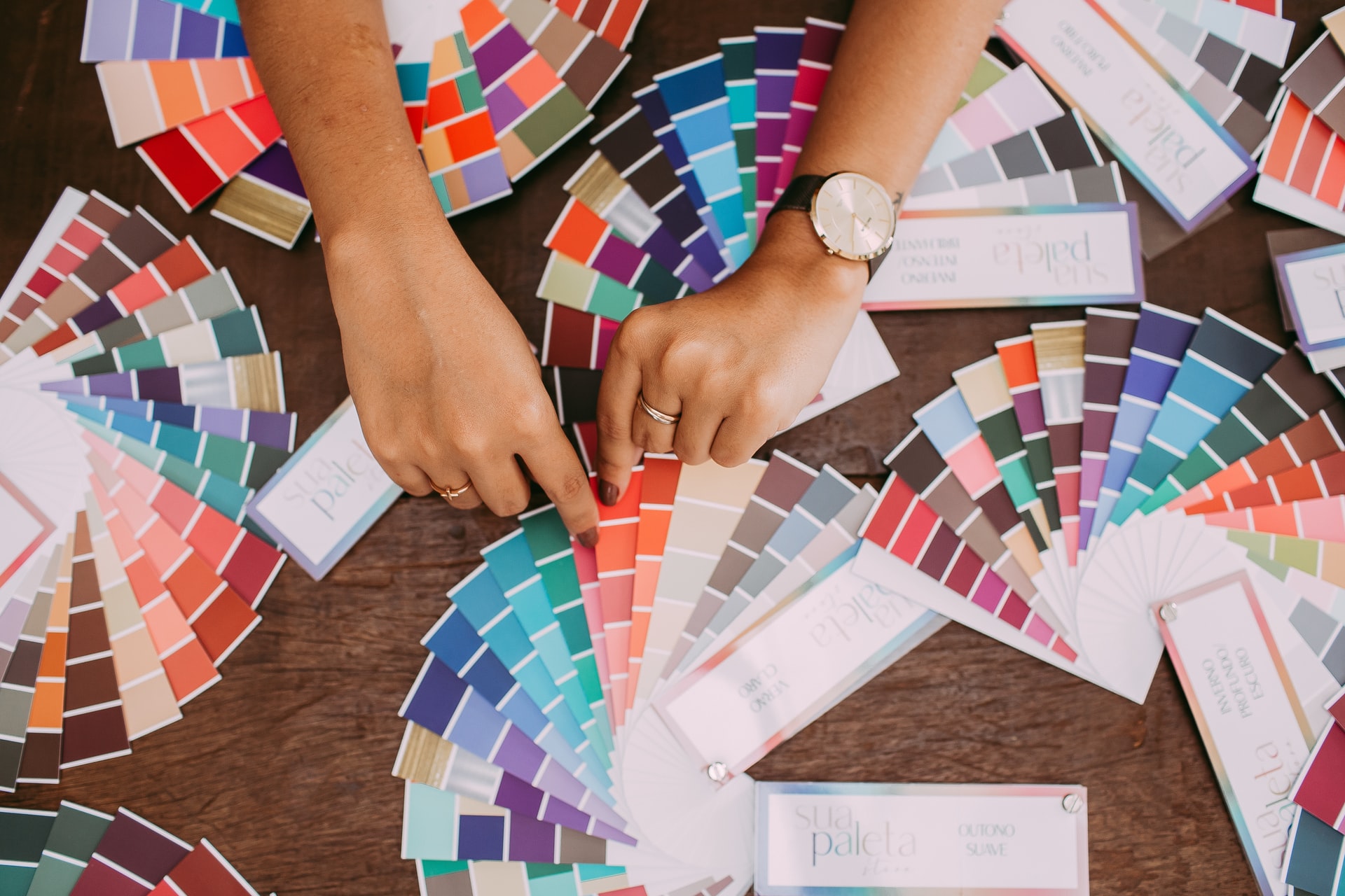
One of the most important elements of the work of a computer graphic designer are colors. Colors on the project must be consistent with reality, the monitor can not falsify colors, because then it will be ineffective. The minimum requirement for a graphics monitor is the sRGB palette, but this is not the best choice. For professional purposes, a much better option would be the Adobe RGB palette, which provides a fuller and higher level of reproduction. In addition, it contains a wider spectrum of greens, which is particularly important when processing photos or preparing materials for printing. It is also very important to calibrate colors, which allows you to display the color palette as close to reality as possible. Thanks to calibration the monitor displays the image with the set parameters of brightness, white point temperature and hue gradation. Many models of monitors ideal for work for graphic designer, in different price ranges, you will find in AVPoint store.
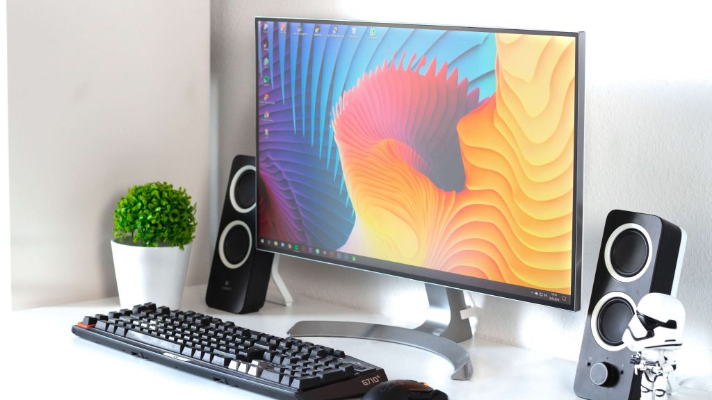
The monitor screen for a computer graphic designer should be a minimum of 24 inches, but the most optimal size will be 27 inches. This minimum diagonal provides comfort while working and more possibilities to spread the tools on the screen. A larger diagonal screen also means a larger and more comfortable work area. It is assumed that the bigger the monitor, the better, however, for the health of your eyes, it is best to choose a screen that you are able to grasp with your eyes in its entirety without having to move your head. Speaking of resolution, for a graphics monitor it should be a minimum of 1920 x 1080 pixels, or Full HD.
The type of matrix also matters. Until recently, the presence of an IPS matrix in the monitor was mandatory for graphic designers. Currently, VA matrices have appeared on the market. This is the link between IPS and TN matrices. VA matrices offer the deepest blacks and the widest viewing angles, and thus the same image quality, regardless of your position. VA and curved screen monitor models are also slightly cheaper than other types of matrices.
The type of finish of the screen coating is also an important consideration. A glossy coating is definitely better when it comes to rendering realistic colors. A matte finish, on the other hand, is healthier and less tiring to the eyes. A non-reflective finish allows you to work at the monitor for longer periods of time without straining your eyes. In computer work it is necessary to take care of health, so it is better to choose a matte monitor
In addition to the basic technical parameters, such as resolution or color palettes, additional features that significantly facilitate work are also important. Such a parameter is, for example, brightness stabilization, which allows you to instantly restore the brightness level of the monitor, and thus quickly return to work after turning the computer back on or coming out of sleep mode. Also, the USB port is a useful but not necessary convenience. Every computer has such a port, but a flash drive input in the monitor saves the graphic designer from being prone and distracted while working.
Main article image: photo by Pekic / E+ / Getty Images